Blue color is considered to be one of the most noble. Looking at it, we remember the shades of the sky and water, the elements that can be watched endlessly. Blue has also been used in art and jewelry since ancient times. It was considered the most expensive, since for a long time blue paint was made from the precious stone lapis lazuli. Accordingly, afford blue clothes only rich people could. Perhaps that is why this color is associated with something regal and majestic for many on a subconscious level.
Shades of blue
This color has many different shades, but three of them are most often used. These are cyan, azure and ultramarine. The first shade, cyan, is a cross between green and blue. For this, it is often called the shade of the sea wave. Azure is a shade of blue that is close to blue. This is what the sky looks like on a cloudless day and clear sea water. Ultramarine is the most intense, deep, magnetic shade of blue. Sometimes it is also called an electrician. Ultramarine is also a coloring matter, a mixture of silicon, sulfur and aluminum. Thanks to his invention, the blue color gained great popularity. Other shades of blue have no less euphonious names. For example, sapphire, midnight blue, Prussian blue, denim, etc.
The symbolic meaning of blue
Blue is the color of the sky, literally and figuratively. Please note that even in Christian icons, blue almost always dominates in color scheme. This is especially true of images of the Mother of God. Blue is the color of purity of body and spirit, aspiration upward, spirituality. In this it is the opposite of red, the symbol of passion. The image of red and blue together, which can often be found on icons, denotes the subordination of the body to the spirit. The negative side of blue is puritanism and stiffness. Hence such expressions as a blue stocking or a blue beard. Here blue appears before us as a symbol of coldness and detachment.
This color is also one of the symbols of royal power, noble origin. "He is blue-blooded" - so often they say about the representatives of the upper class of society. V ancient world clothes blue flowers most often worn by priests and kings. Thus, they made it clear to the common people that they are connected with the sky, belong to the highest caste. Traditionally, blue is considered a masculine color associated with willpower, logic, and spirituality. In our culture, boys from the very early age accustom to it, dressing in blue or blue clothes, buying toys of this color. However, it is worth remembering that women can also possess these conditionally masculine qualities, strong intellect and developed will. Therefore, the monopoly of men on this color is gradually becoming a thing of the past.
Physiological and health effects of blue
The blue color is known for its special effect on the central nervous system and other organs of the body. Its uniqueness lies in the fact that it invigorates and calms at the same time, that is, it harmonizes. If a person's excitement prevents him from working, he high blood pressure, blue will relax and soothe him. A tired, exhausted person with a weakened immune system, blue, on the contrary, can cheer up.
It is worth remembering that the darker and deeper the shade of blue, the more pronounced its sedative effect. Such shades reduce arterial pressure, slow down metabolic processes in the body, tend to sleep. Therefore, it is better to use them in the afternoon. Light and bright shades of blue have the opposite effect, invigorate and stimulate. Therefore, before the start of a working day, an important meeting or an exam, it will be useful to meditate on lapis lazuli. This stone is painted in a beautiful, heavenly blue color. It is also the color of a strong will, so working with it can help those people who exercise a lot, diet, etc.
The psychological impact of blue
As mentioned above, blue is an energy harmonizer. It reduces excess nervous tension and gives strength to those who lack them. Blue improves memory. It has been observed that in rooms painted blue, people work and study better. This color mobilizes, helps to focus on the goal, discarding everything unnecessary. Therefore, psychologists advise using it for people who are quickly distracted, restless and absent-minded.
The blue color unobtrusively disposes to trust, emphasizes the strength and authority of the person using it. Perhaps that is why this color is most often used in the dress code of various serious companies. It is the color of security and protection. top level. Please note that it is used by almost all international defense organizations, for example, NATO or the UN. There is a lot of blue at airports, train stations, that is, places with an increased risk of danger.
Blue color in clothes, image
Blue clothing and accessories are an essential element of business style for both men and women. It emphasizes such qualities as professionalism, seriousness, wisdom, reliability. It should be used to make a good impression on the employer or your business partners. Recently, however, blue has been increasingly used by fashion designers to develop collections for casual and festive wear. With it, you can create the image of a real lady, elegant and mysterious. Blue is not very conducive to communication, but it weeds out inappropriate, obsessive fans. The lady in blue wants to be treated as courteously as possible. On a subconscious level, this shade emphasizes the intelligence of its owner, her restraint and nobility.
The blue color in clothes is quite versatile, suitable for women with any skin or hair color. However, owners of pale skin with a pinkish undertone should not overdo it with this shade, it can emphasize their imperfections. Women with an aristocratic porcelain complexion or owners of a golden undertone, tan, can wear it in any quantity. Makeup using blue shadows or eyeliner is appropriate only in the evening. Use blue shadows only if your skin and hair tone is cool tones. Blue mascara is often chosen young girls to highlight your originality.
Blue color in the interior
This color is a leader in the design of various work spaces, offices, reception rooms, etc. Designers advise to use it to the maximum dark options those companies that work with law, medicine, information technology. It uses combinations of blue and white, gray, black. For other areas of activity, an excess of blue and these color combinations may be too heavy. When done right, blue looks great in home interior, especially the newfangled hi-tech style. Blue and silver as the main colors are suitable for both the living room and the kitchen, made in this style. However, it is worth remembering that hi-tech will appeal only to those people who prefer minimalism and rigor to home comfort.
In the living room, this shade will look stylish, but it can somewhat fetter guests and households due to its formality. Blue in moderate doses is good for the bedroom, because it calms and makes it easier to fall asleep. However, it should be avoided by those couples who have problems in bed. Blue can aggravate problems with sensuality. This shade is perfect for decoration. home office, especially for those people whose work requires mental stress. In small doses, blue of lighter and warmer shades (azure) can be combined with yellow, green.
blue in advertising
According to statistics, this color is most often used in advertising. Especially it concerns information technologies. Remember the most popular social networks, their logos are blue. Psychologists believe that in this way their owners convince users of the prestige of their service, that their data is reliably protected. For the same reason, blue is often used by banks.
Color and character: love for the color blue or its rejection
If a person considers this color to be his favorite, this indicates his seriousness, restraint, and reliability. People who love this shade are used to relying on logic and intelligence. They cannot stand strong emotions, considering them a manifestation of weakness, they can hardly be called romantic. These people are purposeful, clearly know what they want and will do a lot to make their dreams come true. However, they will never go to meanness. moral standards sacred to them.
If someone does not like the color blue, this can mean two things. Either he lacks the qualities of the blue color (reliability, seriousness, spirituality) or he is tired of his own obsession with them in the past. Blue is often disliked by people who have been "blue stockings" or nerds in the past and hide it. If a person does not like the blue color throughout his life, this may indicate that he is used to taking life lightly, "without bothering."
Hue sky blue fascinates and beckons humanity in the same way as thousands of years ago. Looking into it, we reflect on eternity, the meaning of life, spirituality. He makes us grow and develop, reach up to the sky. The color blue reminds us that we are all children of the universe and should be proud of it.
Tatyana Kulinich for http: // site
Website All rights reserved. Reprinting of the article is allowed only with the permission of the site administration and indicating the author and an active link to the site
Blue clothing has remained at the peak of popularity over the past seasons. This is a favorite shade in many countries of the world. Regardless of what season it is, the weather, and regardless of the profession and position in society, many people prefer shades of blue in clothes. But really there is plenty to choose from here: delicate blue, summer and naive cornflower blue, bold electrician and others. This beautiful color has many variations and each of them is wonderful in its own way.
Light, dark or bright - which shades of blue will you choose?
Cloth light colors is a basic part of the wardrobe of many employees and office workers. These include the following shades of blue: powdery blue, aquamarine or gentle forget-me-not. As a rule, the dress code allows the use of these shades in a business bow. Most of them look neutral and can fit into almost any style: classic, Provence, etc.
Features of some shades of blue
The color called aquamarine is complex. It has a greenish tint, and due to this it can be harmoniously used for romantic bows. Such sets will look very fresh and feminine.
Sea wave, inky, sapphire - these shades are the best suited for evening bows, for going out, for special occasions.
The richest shades of blue are cornflower blue, electric blue, indigo, turquoise and royal blue. They will look appropriate at parties, holidays, youth events. Bright shades are good because they are the right combination they make the bow more creative.
A truly royal look for an evening or a date will help create blue with the same shade.
What does the presence of blue in the wardrobe say about a person?
About the mistress of the wardrobe, in which shades of blue predominate, we can say the following: this person loves life in all its manifestations, because blue is so multifaceted and always unique. In addition, if a person loves this color, then by nature he is calm, balanced, reasonable. Such people are not too strict and not too emotional.
Combinations complete with other shades
This beautiful and expensive color is present in the wardrobe of every fashionista. Dresses, trousers, shirts, shorts, skirts - all blue clothes look bright, regardless of the shade. In order for it to be appropriate in an outfit, you must be able to correctly combine it with other shades. So, in order for blue to appear in all its glory, it can be combined:
With white. One of classic combinations. For a business look, you can choose cornflower blue trousers and a white blouse. Instead of trousers, a blue skirt is also suitable. You can also wear a blue jacket to the office. For walks and meetings with friends, you can wear clothes of ultramarine color, which will make the image unique;
With black. It is too classic version. It will not look gloomy or dull if you add bright accessories- gold jewelry or silver, red bag, belt. Blue and black dress is perfect for girls with brown eyes and dark hair
With grey. Such unusual combination create fresh look. To keep the bow from being boring, you can wear an indigo skirt and add lightness due to beige or white shoes. You can also dilute the kit with a light or bright bag, gloves or a scarf;
With yellow. A contrasting combination that allows you to create an interesting and harmonious image. These two shades enhance each other's brightness, like the sky and the sun. So, for parties, walks and dates, you can choose a yellow blouse and a blue skirt, or, conversely, wear an ultramarine top with a bright yellow bottom. Shoes can be neutral - light or dark;
With red. This bright combination is suitable only for brave girls. So, you can add a red belt, shoes or a bag to a blue dress. But do not enhance the presence of red with blouses or cardigans. White shirt, inky skirt and red shoes - looks great and is suitable for the office;
With green. This combination can be seen in nature. Due to the fact that green also has many variations, it goes well with blue. It is appropriate to pick up green shoes and a bag, as well as jewelry for a dark dress;
With brown. The spirit of nature is also present in this tandem. It's like heaven and earth, water and shore. The brown tint gives softness to blue, together they look harmonious and interesting;
With purple. Related colors cannot but harmonize in the set, they add brightness, fun, playfulness to each other. To balance the bow, you can wear beige shoes or white sandals;
With gold. As a rule, this combination is chosen for a celebration, for a festive party. To make the outfit seem more aesthetic, the golden hue should be a little less;
With orange. Two colors that enhance each other and make the look summery and juicy. For example, you can choose yellow accessories for an orange blouse and a blue skirt. Such an image will definitely not go unnoticed among others;
With blue. Two close colors that are suitable for office style, as well as for everyday bow and holiday. Accessories can be picked up bright - raspberry or yellow;
With pink. The contrasting combination of blue and pink looks glamorous and is more suitable for a party or going to the movies with friends.
As you can see, blue is base color, on the basis of which you can create many unique images and each of them will emphasize individuality and style.
Blue color is often found in nature. This color does not bother, is associated with the sea, sky, water, air. Why not use it for home decor too? How to use and what to combine
Shades of blue are not only blue, azure, sapphire, dark blue, but also various turquoise, blue-green, sea waves, lilac, purple. Therefore, we can say that blue has both warm and cold shades. Closer to green are aquamarine, cyan. Closer to red - cornflower blue, lavender, amethyst, purple.
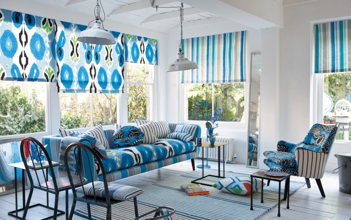
Psychological impact
It is known that the blue color in the interior at the same time relaxes and helps to focus. What will be more - depends on the shade. V large quantities dark blue colors will oppress. Dark shades are associated with mystery, night, intrigue, but at the same time with sadness and cold.

light and more warm colors- these are shades of air, silence, airiness, peace, tranquility. Shades of blue are also associated with feminine, recreation, creativity. This color is well suited for the bedroom, but you should not decorate all four walls in it.

This decor is suitable where you need a calm atmosphere: in conference rooms, living rooms, children's rooms, bedrooms. Also, shades of azure reduce appetite, so if you want to lose weight, decorate the kitchen in heavenly tones.

Best of all, blue-blue colors are suitable for refreshing southern, bright rooms. Northern they will make even darker and colder. Also, do not use blue in the interior of a large and cold room.

Various shades of blue evoke familiar associations:
- sea,
- sky,
- night,
- air,
- cool.
Therefore, it is worth using them where such plots are desirable and appropriate.
dark shades
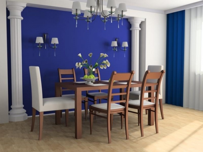
The shades of the night sky in the interior require caution. Sometimes they can create a gloomy, inhospitable atmosphere. It is best to use them in large rooms- dark blue walls will make a small room cozy. In the interiors of large rooms it is better to avoid dark shades of blue color.

light shades
Light blue, blue tones visually expand the space, so they are recommended for use in small rooms. Can do blue walls or ceiling. On the contrary, you can hang a mirror on a light blue wall - this will expand the room even more, this technique is used in narrow corridors. And the blue ceiling will appear higher.

Due to the property of making the room more spacious in large rooms, it is better not to use such decor; instead of large planes, use accessories of this color.

Combination with other colors

with yellow
Blue and yellow are a bright and contrasting combination. How to create harmonious interior with two such dissimilar colors?
- Both colors should be either warm or cool.
- Even pale yellow creates a strong contrast with blue.
- It is better to take colors not in equal proportions, but about two-thirds of blue and one yellow.
Light yellow and cornflower blue are typical for rustic style. For marine it is better to take muted and more natural shades of yellow, such as sandy, beige-yellow or closer to orange. The blue and yellow interior is very expressive and unusual, usually in blue and yellow decorate rooms young, creative people, also this combination is liked by children and creates a sense of celebration.
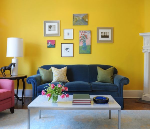
The tone of the sea wave, blue-green, aquamarine, delicate blue goes well with yellow.

With white
Blue and white - this combination is typical for classics, Provence or marine style. This combination creates a feeling of freshness, coolness, lightness, and sometimes even a noticeable coldness, if the blue in the interior is represented by rich shades.

If a lighter and lighter blue color is chosen, then a feeling of lightness and coolness is created. You can dilute the interior with accessories of coffee, brown, scarlet or marengo. Turquoise, indigo, azure, cobalt and other shades will look good with white.

The blue color looks beautiful in the interior in patterns such as Gzhel painting, stripes, zigzags and rhombuses, French blue and white painting, typical for Provencal style, patterns repeating painting on ceramics from different countries.

You can combine plain white and blue surfaces, but then it is recommended to use white for walls and ceiling, and blue for furniture, windows, accessories. It is better to leave the floor in a neutral color. White does not have to be snow-white - you can choose close tones:
- cream,
- creamy,
- beige and white
- the color of coffee with milk.

With orange
Orange is considered the best partner for blue. For marine style, for example, combinations of blue and ultramarine with natural shades of orange, such as sand, are traditional. To create a tropical atmosphere, use more bright options orange, but not neon - in combination with bright blue, it is tiring. For use in the interior, more muted tones are better:
- pumpkin,
- peach,
- sand,
- amber,
- salmon,
- beige-orange.

Advice! The blue color in the interior in this case should also be saturated so that the orange does not drown it out.
with brown
Wood goes well with shades of azure - both natural and various shades of wood. This combination is typical for a marine style. It is better to choose a tree of rich color: red-brown mahogany, dark varieties of oak and walnut, cherry, teak, chestnut.
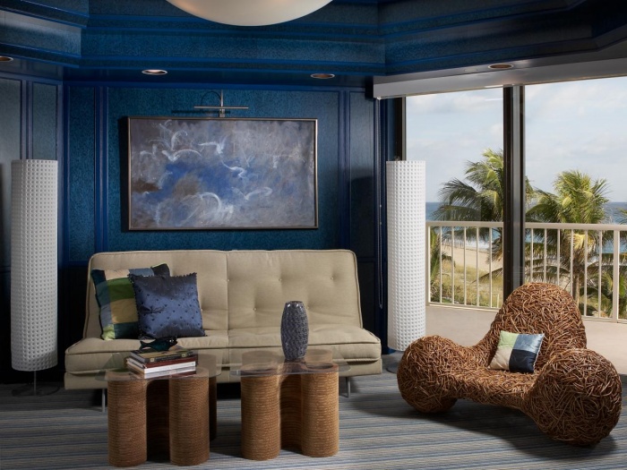
The union of blue and brown is also interesting. Brown - warm color, it softens the cold of blue. In large rooms, it is appropriate to use rich shades of both, in small rooms - gentle and light, otherwise the room will turn out to be gloomy. Shades of blue are perfect for beige-brown and other pastel colors.
![]()
Beige and blue interiors create an impression of simplicity and elegance, such combinations are suitable for decorating any room, especially the living room. The only exception is for children.
With red and pink
Blue and red are an exciting combination. You won’t be able to calm down in a red and blue interior, so it’s better to make one color background and use the other as point accents. Which one depends on the task: if you need to make the room warmer, you need to increase the proportion of red, and if it is cooler, blue. You can also balance and soften the contrast with white. An example of a red-blue interior is in the photo.
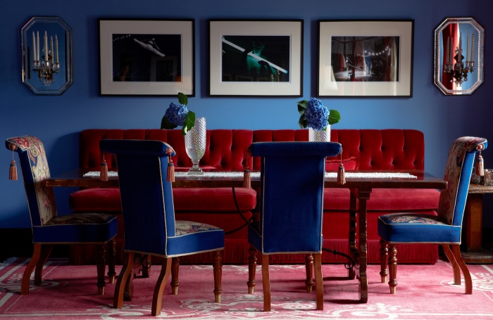
The combination of blue (cyan) and pink is typical for the pop art style. Both of them should be about the same in brightness and either warm or cold. in pink and blue color often make rooms in which children of different sexes live.

with green
Blue and green are often combined in nature: foliage and sky, grass and water, but in the interior it is difficult to combine them correctly. Therefore, for a long time, such a combination, both in clothing and in the design of premises, was practically forbidden. Now these conventions are discarded, but blue and green on color wheel are located close, so it is important that they do not merge into something incomprehensible.

To do this, they must either be separated in space, or make one bright and the other light, muted. Blue-green can also be used as the main interior color.
- Light green goes well with electric, aquamarine.
- Goes well with bright green turquoise tones. They harmonize well with pale green.
- Classic blue pairs with pastel green: mint and spring green.
- Sky blue matches emerald.

Both of these colors have calming properties, pacify, have a good effect on vision, and are associated with nature. Blue-green cuisine reduces not only appetite, but also the desire to eat sweets. And in the bedroom of such shades it will be easy to fall asleep.

Advice! It is good to add accessories to such an interior. warm colors, without them, the situation will turn out to be too cold.
With gray and black

The combination of gray and blue looks noble and strict. At the same time, any shades are good friends with blue. gray color in the interior:
- matte grey,
- pearl gray - suitable for blue and purple,
- dark gray - goes well with transparent blue.
It is better to use tones that are closer to purple, to the red part of the spectrum: purple, lavender.

And the combination with black is undesirable for an apartment: if it is dark blue, it acts depressingly, and if it is light, then it does not look very good. If you still decide on such a design, place accents with lamps with warm yellow light.
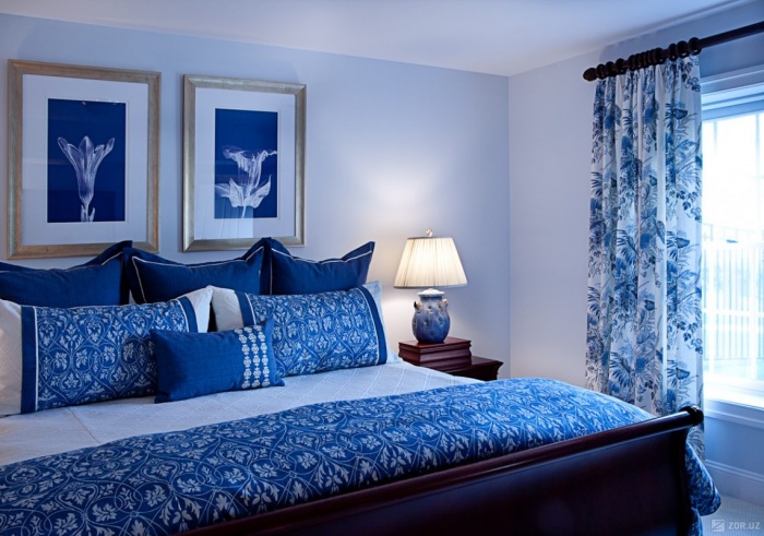
Gold and silver also work well with different shades of blue, but it's important not to overdo it. Such colors should be used sparingly, as separate accents.

You can make a room and completely in blue color but use different shades. For walls in this case, choose the lightest, and for furniture - the darkest.
Conclusion
Blue is almost universal. It will find its use in any room of the house. It is important to combine it correctly with other colors to get a beautiful and harmonious interior.

